
Punct and Layer
Postcard front
Combining the wood elements of Shelley Scott’s work with my own layered paper, I created a postcard to invite the folks in our network to our MFA exhibition. The materials become a visual diagram to express the individual elements in the show, as well as the collaborative.

Punct and Layer
Postcard back
Combining the wood elements of Shelley Scott’s work with my own layered paper, I created a postcard to invite the folks in our network to our MFA exhibition. The materials become a visual diagram to express the individual elements in the show, as well as the collaborative.

Proposed Yohee Logo
Yohee is a line of jewelry that features nature-inspired line drawings on wood. The designer, Shelley Scott-Smolen, approached me to create a logo that captures the complexity of her work in an iconic way.

Eyeland visual branding
When I began a new section of my studio, Eyeland, I decided to keep the visuals simple and handmade. The hand drawn logotype rests on a dark grey—a nod to the chalkboards in my studio, which used to be a classroom.

Eyeland pattern
In the initial stages of designing Eyeland’s visual branding, I sketched pages of different eyes. These little babies became a pattern in newsletters and on the back of business cards.

Compose a Loom
Poster
Bringing in visiting artists to the Appalachian area was one of my favorite aspects of programming for Eyeland. These posters were hung up around the small town of Marshall, NC, and in neighboring Asheville, to promote Taylor’s workshop. This slow and laborious method of advertising was actually one of the best ways to get the word out in this tight knit community.

Marshall Handmade Market
Ad suite
The Marshall Handmade Market is the most loved by vendors and visitors in the West North Carolina area. I designed their marketing materials with whimsy and a hint of the holidays in mind.

Marshall High Studios
Poster
Lights and lanterns hang sleepily in the vast auditorium at Marshall High Studios, and are part of the dreamy fabric of the space. After a handful of people asked to visit my studio at MHS, I decided to host Open Studios once a month. These posters populated community bulletin boards, florist windows, and brewery bathroom walls.

Play 2 Success
logo
Pamela Miller guides professionals to find clarity of purpose and helps them build success from the inside out. She needed a logo to represent the branch of her coaching business that utilizes play to engage her clients. The movement of the final design is lighthearted, yet professional, and illustrates continuous cycle of play and success.

Let's Talk: Break Bread, Break Borders
Pattern for endpages
In addition to laying out the second issue of Let’s Talk, a book produced by Make Art with Purpose, I was also tasked with designing the patterns for endpages. Inside, artist Tessa Hull illustrates the stories of three refugee women who found solace in cooking. The rotating BB motif rotates within a stylized weave, and the colors are inspired by textiles from Syria and Myanmar, the home countries of the women.
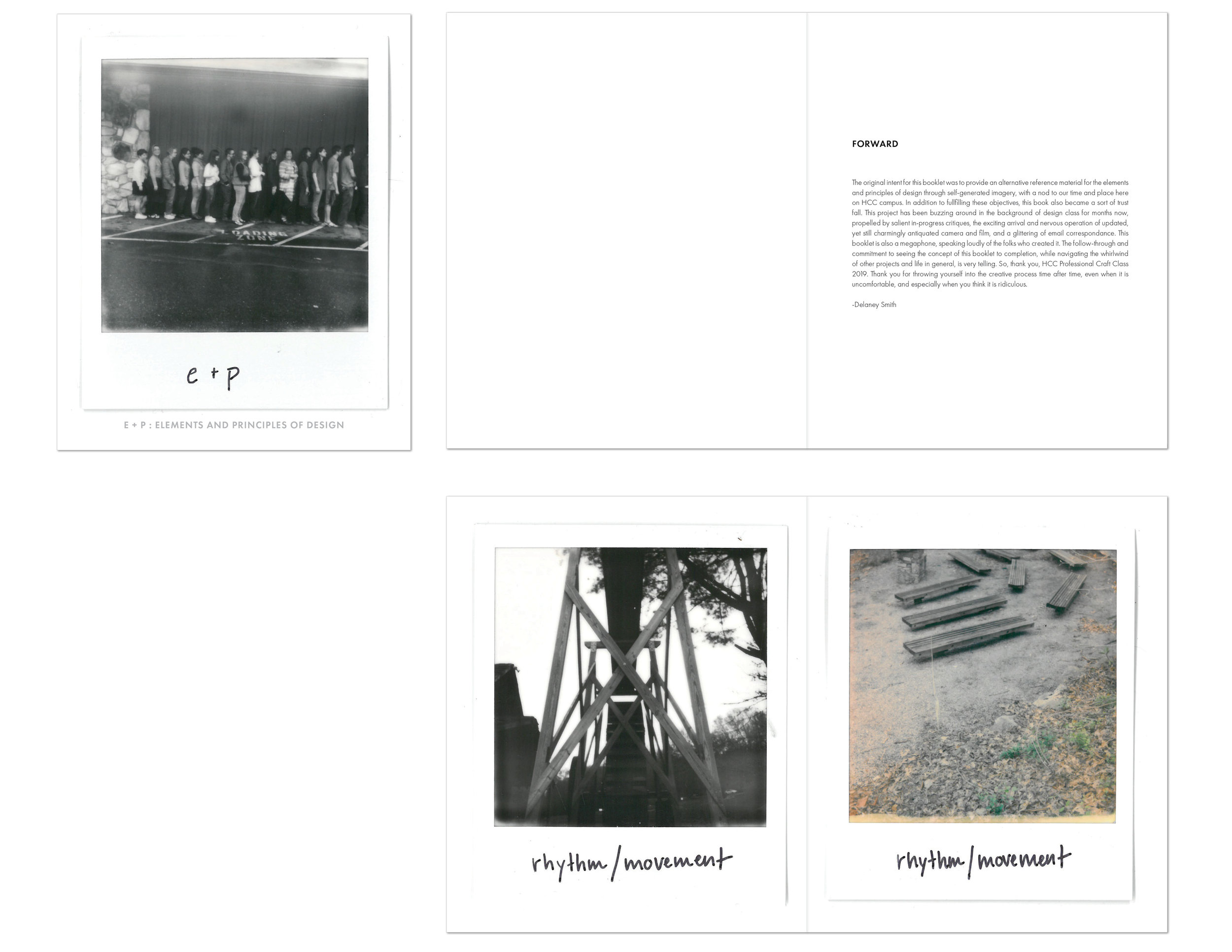
E + P
Booklet
In Spring 2018, I art directed a project for my Professional Craft Design class after receiving a grant from Haywood Community College. The grant provided funding for a Polaroid camera, film and printing costs. After countless rounds of preliminary iPhone photos, the students captured the elements and principles of design on film, then I scanned and compiled their photographs into a book. They each received a copy to keep as self-made design resource.